

Surfboards, logos, rain and movies (with short reel)
ZIGGY STARDUST AND THE SPIDERS FROM MARS
What a month July has been. A lot of something and somehow nothing! The latter part of May and into the whole of June had outstanding weather, sunshine, day in, day out. Then came July.
I guess there are a few positives when the rain arrives in what is summer. Now, these aren’t obvious and it could just be a grind through the cognitive gears to find acceptance in the disappointment.
There were two movies I wanted to see at the beginning of the month, and with the rain outside, it felt better to be inside and entertained while knowing glorious beach or bbq weather was not being missed.
The global premiere of Ziggy Stardust was shown on 3 July 2023. I wasn’t exactly sure what to expect, and after a short introduction plus talk among a panel of guests, the film began.
Ziggy Stardust and the Spiders from Mars is a 1979 British documentary/concert film. The premiere showing on the 3rd of July was no coincidence, it was to mark the 50th anniversary of David Bowie’s last show as his famous alto-ego, it was 50 years to the day since this last performance.

In the cinema, eagerly anticipating the start.
It was immense, breathtaking. Not just as footage of a gig, but how it captured the time, atmosphere, audience, energy, backstage and David Bowie morphing into the performance and being at one with it.
It is fantastic that the film was made, so forever more there will be evidence of this moment.
ASTEROID CITY (A WES ANDERSON FILM)
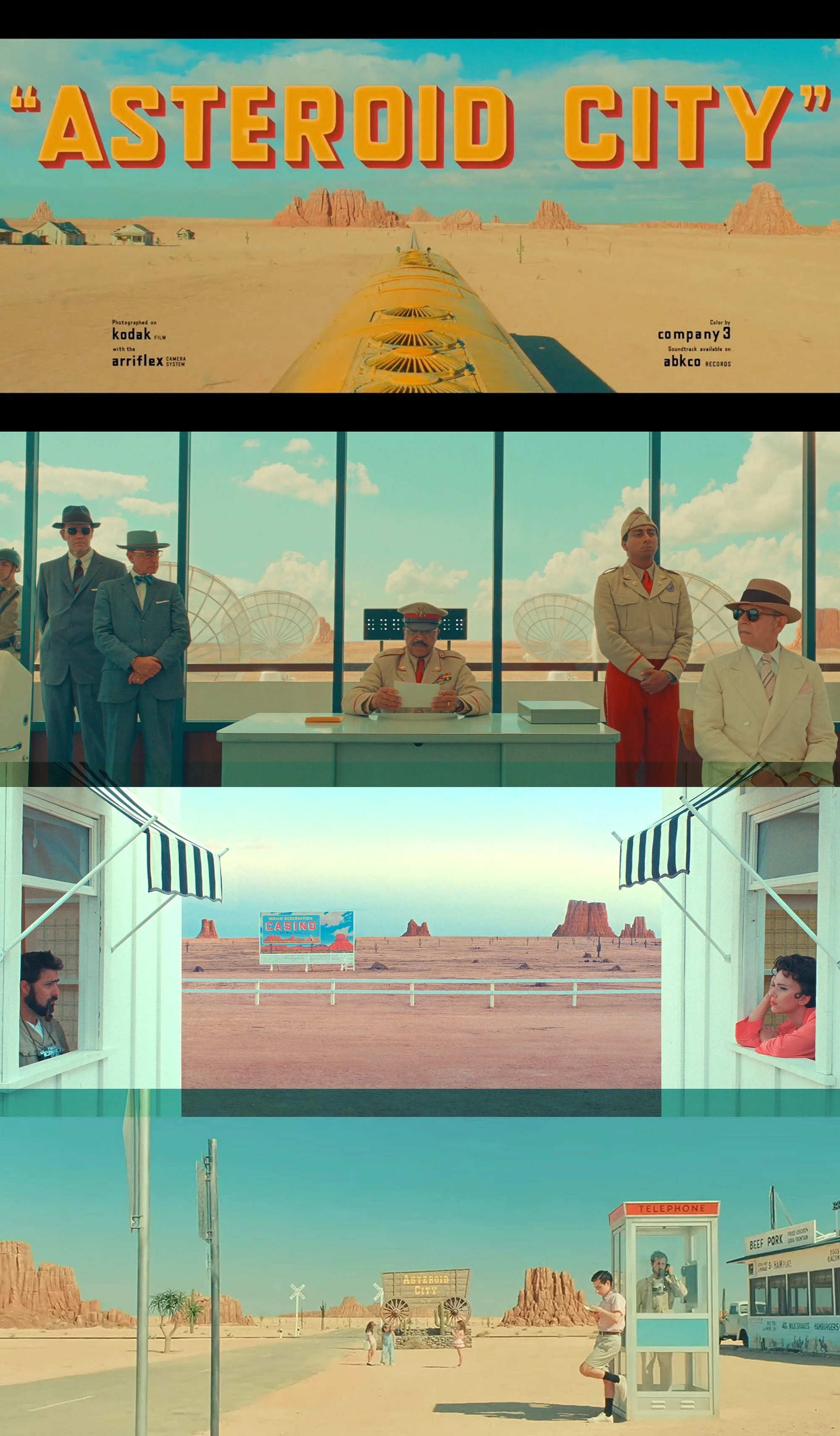
I am by no means an expert on the films of Wes Anderson, but I do know I enjoy them. So it was a no brainer to make the effort to go and see it at the cinema. His work is so stylised it deserves to be seen on the big screen, and ‘Asteroid City’ did not disappoint.
It is quirky and moves at a pace that is its own. It is art that moves. There is so much to comment on, the story, script, colours, composition…the list goes on. And although there is all this to admire, my attention was especially drawn to the composition used in several, if not all the scenes. A kind of minimalist look with objects sometimes isolated to have impact, with little or no clutter around them.
Looking back over some of my photographs over the years, I noticed that I often frame shots that hold the same idea of minimising clutter or distraction away from the composition.

Cover and a few pages from Accidentally Wes Anderson.
I year or so ago I bought the book Accidentally Wes Anderson (pictured above) for the very reason that I seem to gravitate, along with other approaches, to this style of photography.
The forward on the inside cover reads:
Accidentally Wes Anderson began as a personal travel bucket list – a catalogue of visually striking and historically unique destinations that capture the imagined worlds of Wes Anderson.
Now, inspired by a community of more than one million Adventurers, Accidentally Wes Anderson tells the stories behind the most beautiful, idiosyncratic, and interesting places on earth. This book authorised by Wes Anderson himself, travels to every continent and into your own backyard to identify quirky landmarks and undiscovered gems: places you may have passed by, some you always wanted to explore, and many you never knew existed.
Fuelled by a vision for distinctive design, stunning photography, and unexpected narratives, Accidentally Wes Anderson is a passport for modern travellers and fans of Wes Anderson’s distinctive aesthetic, this is an invitation to look at your world through a different lens.
It is great to have the book around to flick through. It serves as a reminder that these interesting frames are all around, making it wonderful to have a camera to capture them.
PHOTOGRAPHS WITH A MINIMALIST APPROACH

1) The old BP filling station on Henver Road., Newquay.
2) Changing room, Newquay harbour wall.

1) Barrowfields shelter, Newquay.
2) Old telescope for tourists to peer across the bay, Newquay.

1) Lamppost and solo cloud at Newquay Harbour.
2) Houses lined up in Nansledan, Newquay.

1) Newquay swimming pool, lockdown 2020.
2) Barber shop, Teignmouth, Devon.

1) Blue buckets, blue sky, solo cloud, Newquay harbour.
2) Yellow bicycles on a yellow van, Porth, Newquay.

1) Gulf filling station, on the road to St Columb Major.
2) Barrowfields, Newquay.
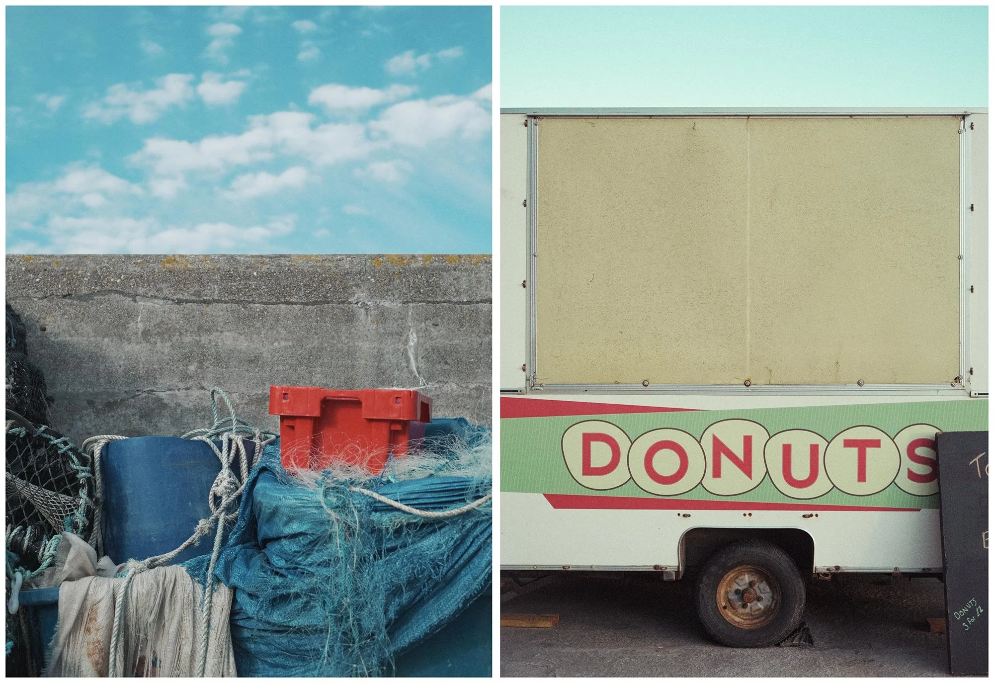
1) One red bucket, Newquay Harbour.
2) Donuts.
I’ve been going out with my camera for years now, I guess it’s the same for many self taught enthusiasts, one starts with an unreined approach, perhaps with a slight incline towards one of the many disciplines – landscape, portrait, street, documentary, sports, or maybe not! With time, practise, energy and experience you may start to notice what your eye finds. I used to print everything, I’ve got a draw full of homemade prints from twenty years ago, if I lay them all out it’s possible to see how I started honing in on certain compositions or subjects.
It’s strange, I don’t really set out to take a certain type of shot, it is one of my happy places to walk, slow down and let my eyes hook onto something.
A COLOURFUL MONTH FOR SURFBOARDS
So despite the surf being shockingly bad for weeks on end, the people still want surfboards. So I’ve been busy at the Ocean Magic factory making surfboards more colourful.
A majority of the work now is fairly generic as surfboard models may have a design/spray that goes as standard with that particular model. But of course, almost from the beginning there has been a strong urge to decorate surfboards in some way.

Another Tie Dye spray makes its way through.
Below is an excerpt from my blog, ‘sleeplessink.blogspot.com’, which is where I post more regularly, along with short reels.
Thankfully in amongst the surfboards coming through the Ocean Magic surfboard factory, many have graphics on them. Not only does this mean work for me, it is also another chance to load the spray gun, dip the bristles of a brush into a paint pot and add colour to what would otherwise be just a plain white surfboard.
Now, there is nothing wrong with a plain board, just a shaped foam blank, fibreglassed and then sanded. It is the choice of many, there is an idea of a surfboard being just for the business of riding waves...no frills.
But for a long time, almost from the beginning of surfboard production, graphics and artwork have been put on surfboards, using several methods, but mainly with an airbrush. It seems to make sense that such an individual pursuit would invite colour for a further scream of being different, especially in the early counter culture days of surfing and surfers.
I have sprayed surfboards since 1989 and have worked in factories all over the world. Essentially the industry still uses the same materials as it always has done. Of course there have been advancements here and there, plus diversions into new technology, but really it is still foam and fibreglass with the option of some colour.


Various steps in the process of spraying a board.

Into the hotbox to dry.
ONE FRAME TURNS TO LOGO
The sequence below was taken during a surf trip to Costa Rica in 2016. Of course I am very happy to have a few shots of me surfing, especially as I have spent thousands of hours in oceans over the years. So with just a handful of photos to hold onto, they are valuable to me.
Also stoked to have one of the frames in the sequence being used for the Ocean Magic logo. I never looked for this to happen, I've been happy to just surf and spray surfboards, a job that has allowed me to go surfing when I wanted to. That said, it's nice to get some use out of one of the many seconds I've been in the water.

A lot of fun!

Singled out for use in logo.
The early OM logo from the 80’s and the current logo with my silhouette.
So all up its been a decent month, although the weather and surf have been iffy. But there is always plenty to be occupied with, so am looking forward to creating more collage, photographs and colour in more surfboards.